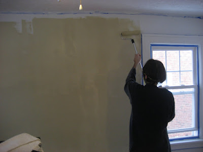
This color looked a lot better on the swatch and on camera than it actually did on the walls in person. It's hard to tell, but it was actually way too yellow/orange, almost like a terracotta, and not at all what we had envisioned for something called, "ivory sampler."
Too bad, we had painted the entire room in one coat before realizing the nature of this color crisis.
However, a new color has been chosen that is essentially this color, but entirely without all the brass.
The major problem with this yellow color was its way of "highlighting" the flaws of our old plaster walls despite all of our hard work sanding, and smoothing them to perfection. It was also too bright, and too rich, making the room feel very awkward, and not very restful. It also closed in the room a bit too much.
We have since learned from our mistakes.
Here are some photos of the intial color:
(coming up next, visuals of the new color vs. the old color)


No comments:
Post a Comment